So I have started to experiment with designs towards my Practice 1 work. I thought i’d start with some designs for an e-textbook as this was my original brief. Going forward I will look to work on some e-learning platform designs as well because I am greatly interested in this area and I feel that there is work to be done on designing for deep learning in both digital publications and e-learning programs. I am also interested in making comparisons between printed textbooks and e-textbooks.
So I am struggling to create and upload a video in time for this project submission that shows the interactivity that my design offers so for now I will simply describe it and upload a video later. The design will also have evolved by then.
Below you can see the sample pages that I have created:
I have created a design using real-life content that exists in a commercially available textbook (Note: This is not a live design project and is a mock-up for personal use only). I felt it important to use real-world content as I could manipulate imagined content to fit my purposes of conveying
design ease for deep learning. In this context I have to make real-life content fit a cognitively friendly layout.
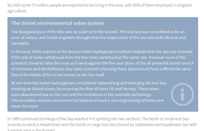
In response to my research in this blog post on colour, I have not used too much colour throughout – just enough to differentiate between types of information and to either bring diagrams to life or act as a tool by which to ease the eye through multiple blocks of similar content (see figure D below). I have reserved the use of orange as discussed in this blog post for an area of the book where content could be monotonous and difficult to maintain the readers attention. I may add more orange throughout this design going forward.
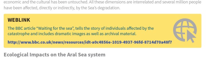
Figures A and B below show my use of different colours and also icons to help readers identify content types quickly on a page. I will look at using icons further going forward and seek research as to their effectiveness in guiding users through content. The web link is of course clickable in the etextbook and opens content in a new tab.
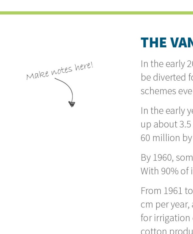
A feature that I added in response to some thoughts I had whilst researching the subject seen in this blog post regarding the Prototype O System is that of a notes feature. Although not a tool to facilitate context-enabled web searches, I am keen on designing content that allows users to make their own comments. Within my sample design, a user can add typed notes in the left margin. Going forward I will look at changing this to a handwritten note function (e.g. with a stylus) to ease note taking and make the process of annotation more intuitive and less clunky. See my blog post here regarding my research on using devices that emulate the paper-metaphor (the latter part of the post).
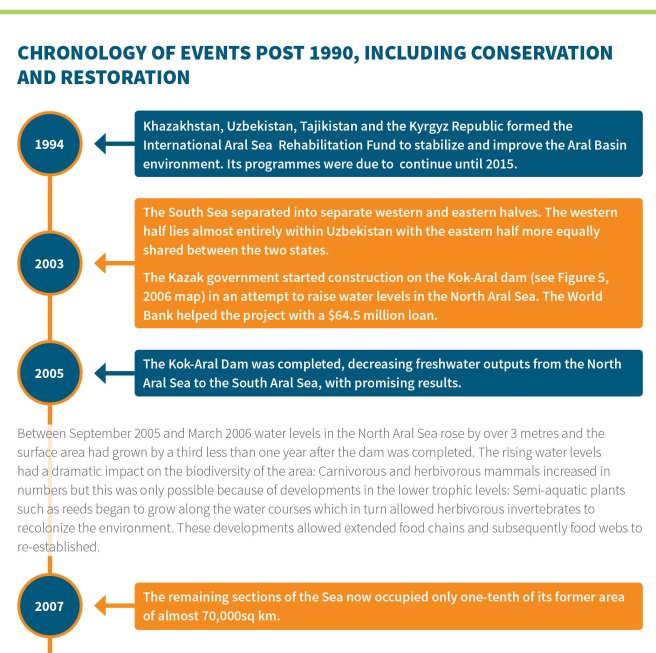
A final area to highlight within this initial design is that of the timeline feature. The original text for this content was a couple of pages of bullet points. I became bored of reading the content very quickly and also lost my point within the bullet point hierarchy very quickly. Within my design I used alternating colour to aide navigation and the text block on the right on appear once you click on a year – helping learners to consume data at their own pace (a theme that has arisen in much research that I have undertaken).