In further researching layout for e-textbooks and eLearning programs I have investigated the various layout patterns that reflect how readers/viewers scan and follow content on a page or in an image for example. This has been undertaken so as to help me in composing the basic structure of my Practice 1 work.
As a photographer in my spare time and also as a part of my employment, I am aware of the rule of thirds for how photographers can better compose photographs for viewers to better ‘read’. On a basic level, the rule structures the fact that viewers pay most attention to areas of the photo that align themselves with the four breaking lines of the image when divided into thirds:
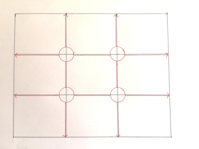
Key points of focus for the image should be placed where the red circles are (such as a portrait subjects head, an animal, flower or an interesting monument, building etc.) and key directional lines (such as the horizon, a building’s wall edge or any other vertical or horizontal features) should be aligned with the red arrows.
This post is aimed at taking this concept a stage further and also applying this theme to other mediums and formats. I can then take the key learning points from this research to better advise the layout of my practice work.
The rule of thirds in photography is developed upon for designed content by looking more closely at the Gutenberg pattern:
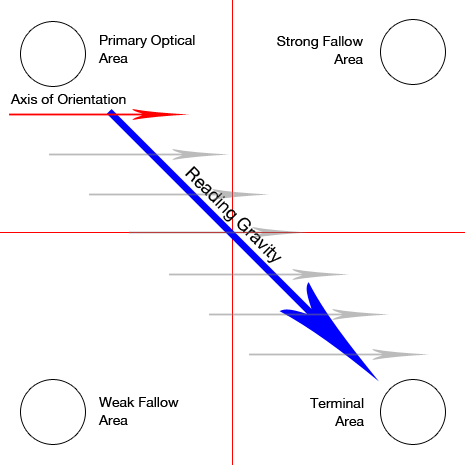
The Gutenberg pattern is pertinent in text-heavy, evenly balanced content in particular. The author of the original blog, Steven Bradley, describes the pattern’s logic best:
“The pattern suggests that the eye will sweep across and down the page in a series of horizontal movements called axes of orientation. Each sweep starts a little further from the left edge and moves a little closer to the right edge.”
So it is made clear here that in text-centric content, key points should be placed top left, with secondary points falling along the line of reading gravity and additional key point being placed bottom right. These keys points could be important text blocks or images/multimedia that enhances or summarises the remaining content. The strong and weak fallow areas will remain largely unread (or not retained at least) unless enhanced by the use of images or multimedia perhaps. The author does mention that of course this pattern would be reversed in cultures where content is read right-to-left, an important variation to consider in my own practice work if I want my solution to be global.
The Gutenberg pattern:
” … improve(s) reading rhythm, by being in harmony with the natural reading rhythm, as well as improving reading comprehension, but there’s little empirical evidence to support the claim.”
What is interesting to me here is the unsubstantiated claim that reading comprehension is improved when content follows the Gutenberg pattern. Perhaps as part of my work in this area going forward I could undertake original research to add academic weight to this argument.
The Gutenberg pattern is very much relevant to text-heavy content and it may be that my Practice 1 work aligns itself to a text-light approach. So I need to investigate additional patterns relevant to simpler designs and layout.
The Z-pattern is such an example of a simpler and slightly contradictory layout to that discussed above:
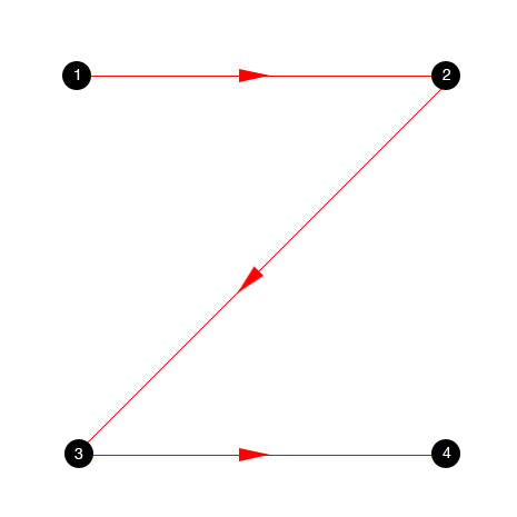
The Z-pattern suggests that viewers read-through the areas suggested as fallow areas in the Gutenberg pattern and if key content is placed along this pattern’s path, it will be effectively absorbed. As mentioned above – this pattern is effective for simpler designs that include little text and that includes more multimedia that a traditional textbook might. This pattern is also very similar to that of the rule of thirds for images. The four points could be seen as mirroring the central circled axis points of the rule of thirds.
One final layout pattern to discuss is that of the more complex F-pattern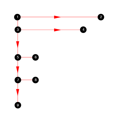
The F-pattern is web-centric and describes the visual path taken by the reader of website content. This is important for me to learn from in that I am interested in developing content for PC’s, laptops, tablets and even mobile phones, so although the layout of my content may not necessarily mirror that of a website, it is to be presented online or electronically so this viewing pattern could advise the structure of my content greatly.
The basic premise of the pattern is that readers read across the first few lines of content (presumably because they feel this will give them a good feel for the remaining content) and then read in from the left less and less as they travel down the page. So key content needs to be placed along the top and to the left of the page – perhaps in bulleted points.
It is important to note here that the F-pattern was developed by studying readers of very text-heavy content including, most importantly, search results. So for my practice work, this could be relevant for considering the layout of multiple bulleted points, long blocks of short paragraphs and reading lists for example.
In summarising this post, it is clear that when designing my project for Practice 1, I need to really consider the placement of key content that will most effectively convey meaning and enable deep-learning and data-retention. In addition one rule does not fit all, different pages of the e-textbook or e-course will need to be treated differently (without confusing navigational items). Also, as mentioned by the author of the original blog, – I have to be considerate of the fact that I can manipulate how viewers read and travel through content by creating my own visual hierarchy. By including directional pointers such as images of varying sizes based on importance, content pulled into feature boxes and the careful use of colour, I can lead readers through content effectively. But when it comes to text-heavy content (where there is no obvious visual hierarchy) I should be very mindful of these patterns.
References:
- http://vanseodesign.com/web-design/3-design-layouts/
by Steven Bradley of vanseodesign.com on February 7, 2011 (Accessed 28.12.15)
All images except the first ‘rule of thirds’ image (created by myself) included in this post were also sourced from this original blog post from Steven Bradley.
 cognitivedesign4etextbooks
One thought on “The Gutenberg and other layout patterns”